

.svg)

Welcome to this quick walkthrough on how to use Super AI! Let's get started.
First, login using Google, Microsoft, or LinkedIn by visiting the URL: demo.getsuper.ai.

To select your data source, click on the “database” icon on the bottom left toolbar and select 'Data Source'. If it's your first time on the platform, click on the "ranch" icon on the bottom left corner to set yourself up.

Now, set up your data source by clicking on “Settings” icon and select the data table. Search the date column (if any) from the 'Column' dropdown.
Next, select 'Type' as Date on the right tab and enable all three options if applicable. Don't forget to click 'Save'.
Next, configure all the other columns. Add synonyms, specify the type, and set the currency or measure type, such as $0.0a. Click 'Save' when done

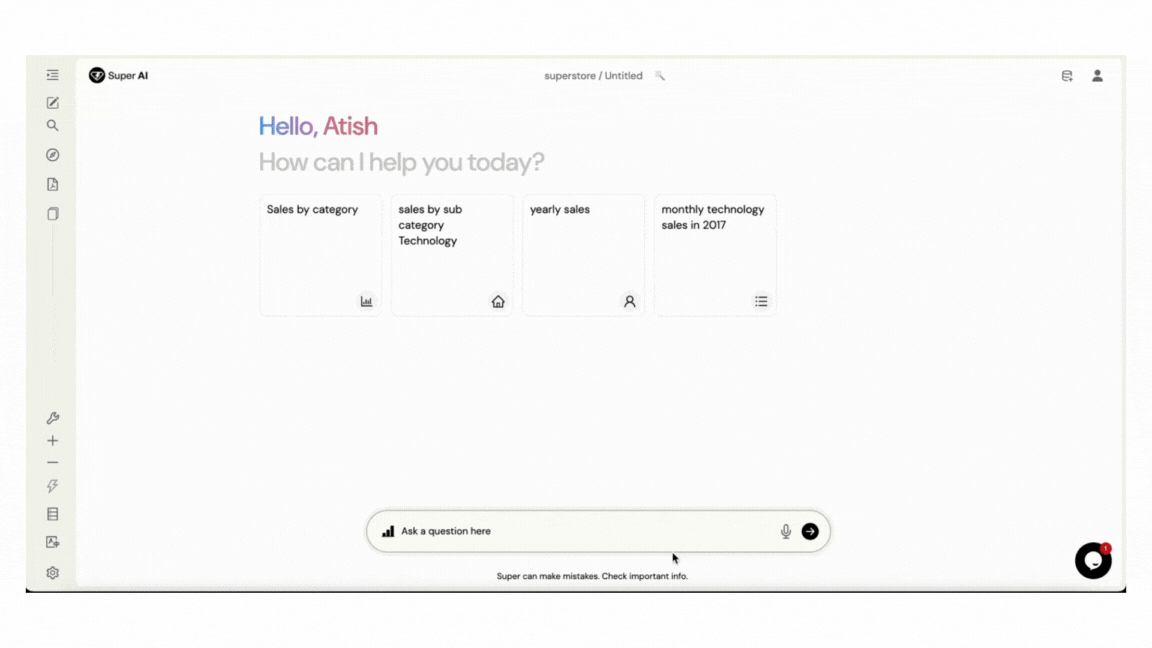
Now you can start asking questions by typing them into the interface or using the mic button for voice commands.
You can change the visual type by clicking on the "Visual" icon at the top right of the result figure.
To edit charts, click the "Settings" icon available when you hover over the visualizations

To export the data generated by the queries asked, simply click on "Excel" icon on the lower right corner. The result data will be downloaded in excel format.

Finally, to edit your question or delete a visual result, click the "Edit" button on the left corner below the results.

To change the source type, click on the Power BI icon in the search box or tap the spacebar twice to switch from Power BI to PDF.

Let’s understand how to use and access advanced functionalities in Super AI.
Description: Utilize "Use Context" to set up the context according the needs of user to query with in specific results.
Usage: Use context [your contextual column or query]

Description: Ability to ask subsequent questions based on previous queries after using context or by just requesting another question and the system will automatically add it in the previous result or new result smartly.
Usage: add [new column]

Description: You can add more visualization by using the add more button available on the right bottom of the visualization in the existing answers and provide queries you want to show along with the existing one.
Usage: Click on the “Add more” button and ask new question. It will show the new visualization along with the existing ones in the same figure.

Description: After generating desired results we can save them as reports for future reference.
Usage: Click on the context on the right-hand side of the resultant window , name your report, give synonyms and click "Save Report".
To access the report, enter "show [report name]"

Description: Tailor reports to display specific data pointsfurther refine reports by asking additional questions.

Description: Use arrow keys to navigate through previous queries you asked.

Description: Access underlying code for query execution.
Usage: Click on the "Show Code" button, to see the “DAX” query generated for the question you asked.

Description: Generate insights automatically or on demand.
Usage:
Automatic Generation: Utilize “Bolt” on the left toolbar, click it to enable.
On-demand Generation: Click on the “Bolt” on the right side of the result canvas and specify the number of insights you require.

Description: Modify column names, types, synonyms, and formats.
Configurations: Date, numerical, and dimensional.
Usage: Click on the “Settings” icon on the left toolbar, in the ”Column search”, search for the column to customize and click the "Edit" icon.
Description: Train columns at multiple levels of their values for enhanced accuracy and edit keywords and synonyms.

Description: Order results based on specified criteria or on display order, by going in after clicking “Context” available on the right hand toolbar along the results.
Usage: Order By [column name]
Alternately, utilize 6 dots drag handle to change order of display for columns in the chart settings.

Description: Filter the results by adding specific conditions in your queries.
Usage: Use keywords such as 'like', 'greater/less than' etc.
Alternately, add the conditions in the chart settings by clicking plus sign besides "Conditions".

Description: In between the analysis, users can share their analysis through an email and schedule the meeting to discuss further about the same analysis.
Usage: Click on the “Email” icon in the lower right corner and fill the email address and other details.


© 2025 Company.


